Do you ever feel like playing with your watercolors, exploring all the juicy gorgeous possibilities without having to sketch a scene first? Congratulations, you’ve come to the right place.
I have two active sketchbooks with distinctly separate purposes.
One I take out on location, to sketch and paint on those lovely days when we’re between blizzards here in New England. I use the other one for indoor “studio” exploration. (Like many of us, my “studio” is also my living room, dining space, heartbeat center of my home. Calling it my “studio” just sets the mood.)
I launched this second Studio Sketchbook a few weeks ago, beginning with the lessons I found in Andy Walker’s valuable course, “Learn the Secret of Successful Color Mixing” (link is in the next paragraph.)
Many of you are familiar with color theory, but when was the last time you indulged in mixing colors for the simple fun of it? Doing so brings color theory to life, right before your eyes. You’ll marvel at how the slightest shifts in pigment-to-water ratios change the mood of a color. You may even create mud by mistake, but no matter; you learned why it happened, a valuable lesson. Besides, some versions of “mud” are actually lovely!
As a result of all this color play, the next time you’re out in the field sketching and you’re looking for the perfect color mix for the sunlight on that weathered fence post, you’ll smile, knowing you have the recipe right there in your experiential memory, not in your theory-brain or, heaven forbid, in a book or PDF you left at home. I highly recommend exploring Andy’s course in a leisurely, fun-focused manner. Andy’s introduction to the course is here.
It costs from $16 to $29USD depending on which discounts are in effect at the moment. No need to wait though, because it really is worth the full price. Andy leads you step-by-step through the basics and invites you to enjoy your own color mixing experience, which is far more exciting and educational than any PDF handout you will ever see. What you learn in this course will apply to all your color work in the future, including when you expand your palette or switch to a different brand. Best of all, it will break you of the bad habit of using colors right out of the tube or pan. Adding at least a dab of some other color will bring the original color to life, as you will discover from your own firsthand experience with Andy’s course.
Creating your color charts will take time, patience, and perseverance. The good news is that all the while you’ll be having fun! If you pour a cup of tea first and turn on some good music or an uplifting podcast, you will find yourself enjoying every minute. I mean, every minute; I even enjoyed measuring out my pencil grids!
When you decide to give yourself the gift of a second sketchbook to use purely for color and brush technique exploration, I implore you to invest about $20 in a sketchbook that has good quality paper; otherwise, your color blending work will be less successful, and more importantly, less fun. The water itself needs a good place to play and move around on its own. 140lb, 100% cotton paper is the gold standard for the best results. Some sketchbooks I recommend are:
Moleskine Art Watercolour Album ($18 for 72 pages)
Pentalic Aqua Journal ($27 for 48 pages)
This final sketchbook suggestion is one of my favorites, despite being made with somewhat lighter-weight paper (95lb. paper rather than the usual 140lb.) HandBook Journal Co. Watercolor Sketchbook: ($18 for 60 pages)
These books are about 5 inches x 8 inches, a comfortable size. I use small clips on each of the unbound corners of the page, especially if I plan to include wet washes in the day’s sketch. Even for small color-mixing squares, the clips are extra insurance that the session will be enjoyable.
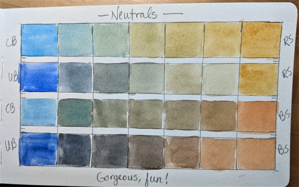
So, back to Andy’s lessons. My favorite page from his course was on Mixing Neutrals.
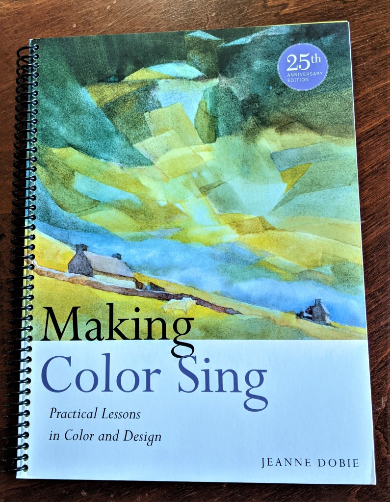
I have long been enchanted by inspired neutrals, beginning back in 1986 when I was studying with a group of beginners, all using Jeanne Dobie’s Making Color Sing as a guide. Brilliant book. (The photo below is of the second copy I bought recently and had converted from a standard soft cover book to a spiral bound version at my local office supply store. Made it far easier to use as a textbook!)
One of my favorite lessons about inspired neutrals is on page 19.
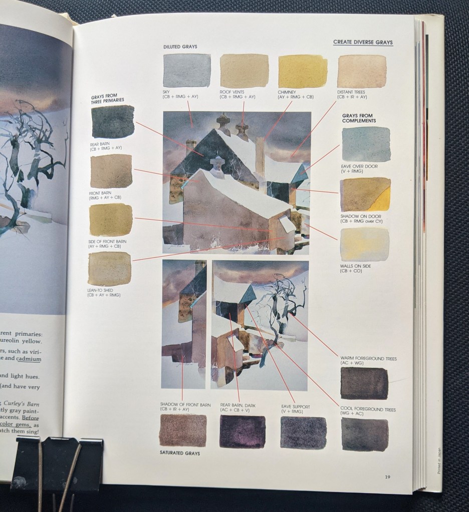
(If I were on a desert island for a year and could bring only one watercolor book, this would be it!)
One way to practice your new understanding of color mixing is to take a small part of a famous painting you like, and try to match the colors. That of course means studying the value (dark vs light) as well as the temperature (toward warm/orange or cool/blue).
Final Inspirations from one of my heroes, Andrew Wyeth
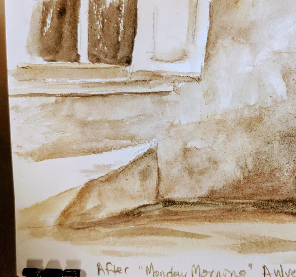
I’ve long admired this man’s creations, and recently I came across Andrew Wyeth’s 1955 work called “Monday Morning.” It is not watercolor, it’s tempera, but it has the same radiance that watercolor is known for. Because of copyright law, I can’t share the image, but here’s a link to a gallery view of much of his beautiful work. You’ll see “Monday Morning” if you click on that link, then scroll down a bit.
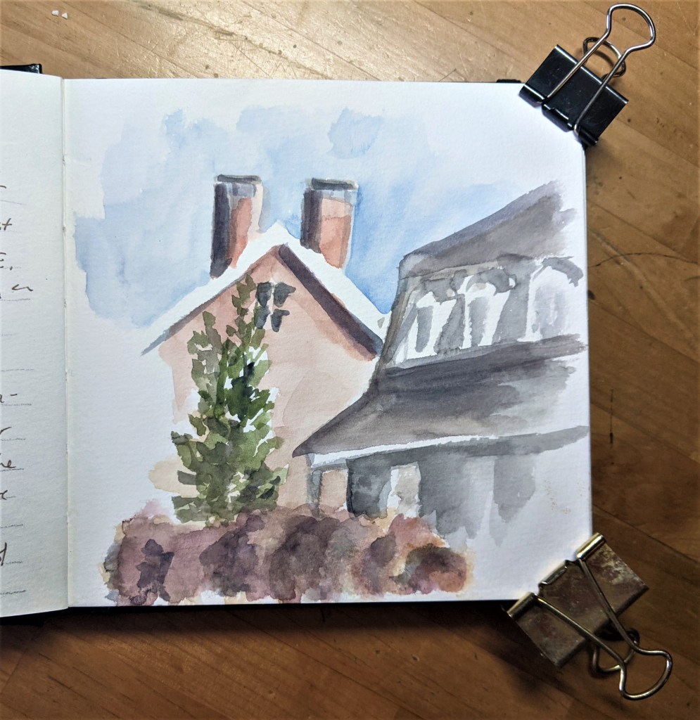
Here’s my recent homework inspired by Wyeth’s “Monday Morning.”
The more time you spend practicing color-mixing and creating small studio study pieces, the more equipped you will be when you head out to create your own one-of-a-kind masterpiece from first-hand, plein air experience.
But what about the rest of the Studio Sketchbook?
I used a Moleskine sketchbook (72 pages) for Andy Walker’s color mixing course which filled up about a dozen pages, so I decided to leave a few more pages blank for future color mixing experiments. Then in the second half of the book (starting on about page 30) I created a new section called Brush Dancing. Here I take lessons learned from Alwyn Crawshaw and others, and practice exploring the vast array of marks you can make with just three brushes. With any luck, that will be my next blog post. Stay tuned!
*******
Your generous or humble contribution to The Tip Jar helps keep this website solvent and is very much appreciated!
As always, feel free to forward this post to anyone you think might enjoy it.
Questions? Comments? Public comments can be posted below.
Private questions or comments will reach me by using the Contact link here.
And, as always, thanks for joining me in some time “aloft”!

Thanks for the kind comments about my course! 😀
I must try and get Jeanne Dobie’s book on color as well.
Great blog, please keep the posts coming.
LikeLiked by 1 person
Thanks Andy, your encouragement is easy to share with all.
LikeLike
Oh my gosh! Thanks for reminding me that I bought this coarse in 2020 and never did it. I’ll get started right away. I could use some help and learning.
LikeLiked by 1 person
Hope you enjoy this enlightening course, Judy!
LikeLike