A careful reader of my new book wrote to me this week with the following question:
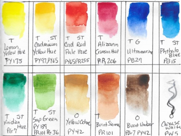
“I just bought Look At That! and the Winsor & Newton Cotman Sketcher Pocket Box you recommended. On the page where you talk about drawing and painting our palette [pages 32-33], the picture has all the colors and they’re labeled and there’s also some abbreviations under each color: T, ST, G, O. I give up. What do those abbreviations stand for?”
Here’s the image:
Here’s my reply:
“Very observant!
When I created that illustration I planned to explain all that, but later realized I was getting too far into the weeds for a book that was intended as a simple overview for shy beginners. But, since you asked, here’s the answer!
Those initials are all to do with the properties (sometimes chemical properties) of the specific paint itself. Understanding those properties will give you a roadmap to more successful color-mixing, and of course, painting.
Remember, watercolor’s magic is due to the way light passes through the paint, bounces off the whiteness of the paper, then travels back through the paint a second time.
“T” stands for transparent, which means the “colored water” is very clear rather than cloudy. You can use it layer upon layer (a technique called “glazing”) and you’ll still get a clear, bright, stained glass effect.
“O” is basically the opposite; it stands for opaque. Those colors are beautiful as well, but the white of the paper doesn’t shine through the paint quite as much. It’s easy to run the risk of creating muddy colors when mixing with opaques, but, having said that, paints labeled “O” have the power to give solidity to a painting, thereby complementing the airiness. The difference between transparent and opaque paint can seem very subtle until you have painted a great deal.
The “ST” stands for staining, which means the pigment itself is a dye, and therefore, once it touches the paper, it’s very difficult to lift it off entirely.
Finally, “G” stands for granular. Granular means just as it sounds, the pigment never fully dissolves so it leaves a lovely bit of granulation that can sink into those tiny valleys of traditional cold-press watercolor paper, leaving an evocative residue pattern.
The explanation by the manufacturer, Winsor & Newton, can be found here. (You’ll note in their explanation that “ST” can stand for “semi-transparent” or “St” can stand for staining. That’s unfortunate, right? The giveaway though is if it already says “T” (as it does in the Sap Green area for example), then you know the ST means “Staining”— which Sap Green is in the extreme!)
Note: These are all descriptions of the pigment compounds, not the colors. And now there’s more to explain!
The abbreviations (like PY-175 by the Lemon Yellow Hue) are the Pigment Codes and are very useful. It’s a universal coding system used by all watercolor paint manufacturers so that artists have a better sense of what they are buying from one brand to the next. Color names can be very poetic (as anyone knows who has gone to the hardware store looking for a simple off-white room paint!), but these Pigment Codes are far more consistent. You can use PY-175 from one brand to another and you should get a similar result, whereas if you search by the English name (like “Burnt Sienna”) you’ll get vast variations. There you go! A detailed color lesson I first learned from an amazing instructor I had back in 1986 who taught us chemistry, and paper compounding, and all sorts of things so we would understand the very bones of watercolor.”
The book that my first watercolor instructor, Gif Russell, used to teach us was brand new at the time in 1986, and has gone on to become a classic. It is Jeanne Dobie’s Making Color Sing. For me it definitely earns the “one book I would take to a desert island” status.
So now you’ve had a glimpse at one of many rabbit holes I had to back out of when writing “Look at That!”. Throughout the book I gently disparaged my fellow how-to-sketch-draw-paint authors for being overly verbose, then I immediately found myself acting just like them, writing way too much with great enthusiasm, only to go back and delete, delete, delete! It is so easy to “over-deliver.” The admonition to “keep it simple” is easier said than done.
Have you bought the book in either ebook or paperback version? If so here’s a question for you:
Have you found any other loose threads in the book? Would you like to send me a quick note through the “Contact” tab above to tell me about it? I know of a few myself. Here’s one:
What about that “rigger brush” I mentioned and illustrated on page 17, but never mentioned again? What’s up with that??
Stay tuned, dear reader. More will be revealed…
