I fell in love with watercolor before the internet was born, before Daniel Smith began manufacturing watercolor paints, so my watercolor foundation was built in a very different world than we see today. The endless sources for today’s online learning are a real boon; the only draw-back is you can easily feel you are sampling knowledge rather than sitting down to a deeply fulfilling meal.
My watercolor roots were planted in September 1986 at the Sharon Arts Center, studying with Giffin Russell. The book she used as the basis for her teaching was Jeanne Dobie’s Making Color Sing which was first published that same year. My teacher’s loyalty to Jeanne Dobie’s approach convinced me that ‘for the time being’ I need look no further. That foundation remains rock solid, and informs what I learn from all other watercolorists today. The book is now available in three formats: hard cover, paperback, and spiral. The content is the same in all three; the only difference is the covers.
Mouse Power

Of all the chapters in this book, the section that has stayed with me for the last thirty years is called “Mouse Power”. It describes one aspect of why some watercolor paintings glow and others miss the mark. First I need to share a bit of core watercolor theory.
Watercolor Chemistry 101
According to Ms. Dobie, every serious watercolorist needs to understand the mechanics/chemistry of their paints before they start making specific color choices. (It is important to note the paints she used were all Winsor & Newton brand. That makes a big difference when it comes to names of colors. I will stay with that tradition for now.) In this book you learn that all watercolor falls into three types:
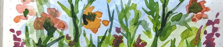
Transparent non-staining: These are my favorite colors in many ways. They can be pale or strong, always mix beautifully, and if you change your mind there are ways to lift the color off the paper without leaving any trace of it behind. Her basic red/yellow/blue here are rose madder, aureolin, and cobalt blue.
Transparent staining: As you may have guessed, these are similar but because they are dyes, they will stain the paper. They tend to be strong, saturated colors too, so a very little bit goes a long way. Primaries here are Winsor Red, Winsor Yellow, and Winsor Blue.
Opaque/granular: Although all paint is opaque if you put it on thickly enough, these colors have an innate granular texture so even when they are watered down, the granules never fully dissolve, and therefore they create a visual texture all their own. Colors commonly used in this category are all the cadmium colors. My three favorites (non-cadmiums) are Burnt Sienna, Raw Sienna, and Ultramarine Blue.
Back to the greys
As you learned in Color 101 in elementary school, Red, Yellow, and Blue can theoretically make every possible color under the sun. To begin discovering mouse power, we use the three colors from that first category: rose madder, aureolin, and cobalt blue. If you mix equal parts of all three, you get an absolutely neutral grey. But we don’t stop there.

Mix that neutral grey, and then “push it”
If you want a grey shadow next to a carrot, push the grey toward blue (the complement of orange) by adding more blue. If the shadow will be next to a green apple, take the neutral grey and push it toward the complement of green which is red. The reason for this is when complementary colors are next to each other, our retinas respond by firing in a different way, setting up a very subtle vibration. Mouse Power!
If this sounds a bit boring, look what happens when Jeanne Dobie plays with greys.

Final Discovery
What I discovered by writing this post is I want to fully embrace this book again. My project for this summer is right in front of me: Reread and truly study Making Color Sing. Dedicate an entire sketchbook to it and do every lesson. I am surprised and pleased. There is no risk here, I know it is still pure gold.

I too enjoy Jeanne Dobie but I’m not a fan of Winsor & Newton watercolors. I found that she’s updated her watercolor list with comparable and contemporary Daniel Smith paints. It’s fascinating!
http://www.jeannedobie.com/palette.html
LikeLiked by 1 person
Thanks Dana!
LikeLike
A great summer project! As a non-artist, avid fan, I love this subtlety.
LikeLiked by 1 person
Thanks Maggie. I am very aware that my love of color nuance is also why I like traditional English landscape artists. Take brilliant colors, add a bit of grey to the mix, and I swoon! 🙂
LikeLike